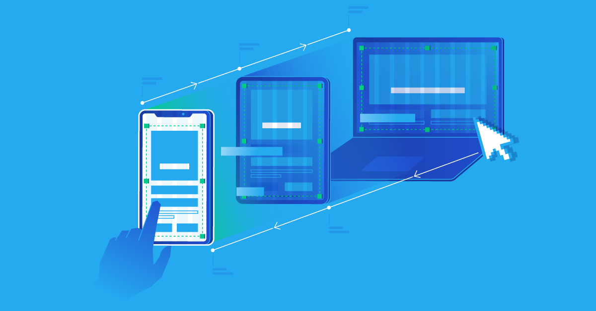
There are three main approaches to web design: responsive, adaptive, and mobile-first.
Each approach has its unique characteristics and benefits.
Responsive Web Design
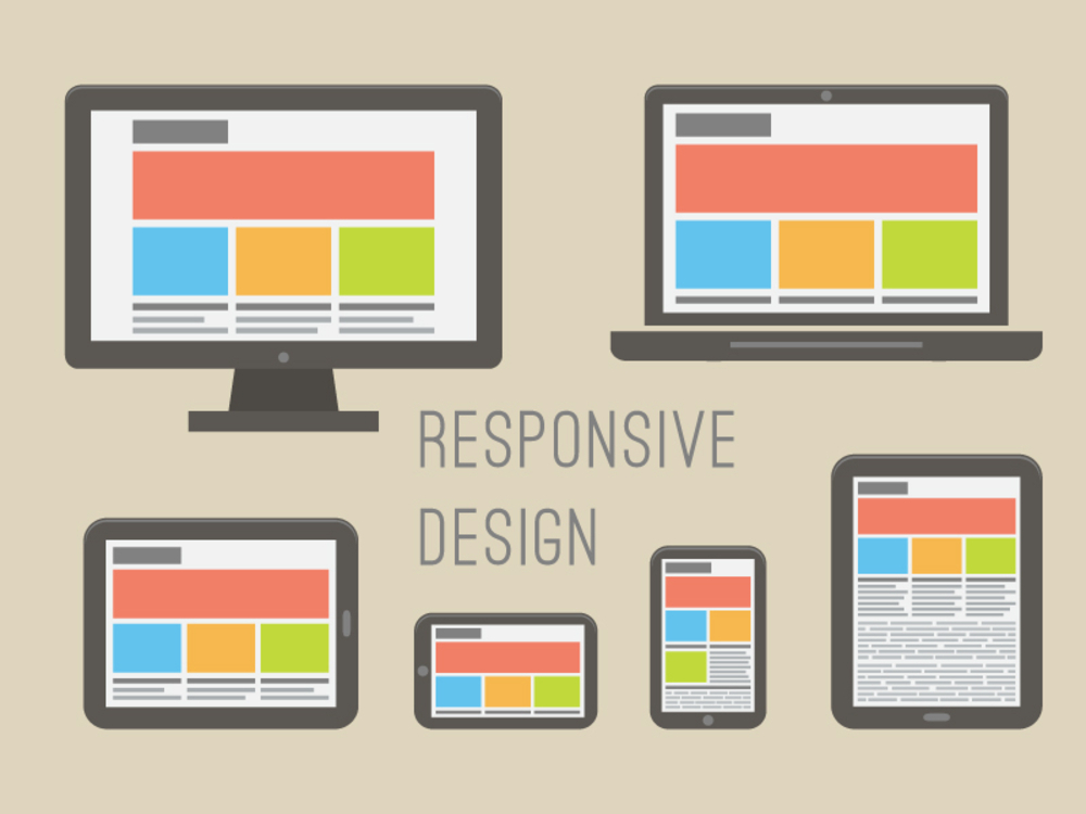
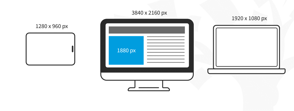
Responsive web design is a design approach to making websites that can adjust to different screens and devices. When you use responsive design, the website automatically changes how it looks and what’s on it based on whether you’re using a big computer screen, a small laptop, a tablet, or a mobile phone.
This makes sure that everyone has a good experience, no matter what device they’re using. The key idea behind responsive web design is something called CSS media queries.
These let the website figure out what kind of screen you’re using and then make things look right for that screen.
So, it can switch from a big screen layout to a small phone layout without making the text hard to read or the website hard to use.
One of the key advantages of responsive web design is its versatility.
With a responsive website, businesses only need to maintain one version of their website, reducing development and maintenance costs.Responsive design also makes your website perform better in Google search results because Google likes websites that work well on mobile devices.
Advantages of Responsive Web Design
Responsive web design (RWD) is a method in web design that focuses on ensuring web pages appear correctly on different devices and screen sizes.
It offers several advantages, which have made it the standard practice for modern web development. The key advantages of responsive web design:
- Wide Compatibility: Responsive designs work well across a broad range of devices, making them a versatile choice for most websites.
- Easier Maintenance: Using one codebase for all devices makes updates easier and saves development time.
- Search Engine Friendly: Search engines favor responsive websites as they offer a consistent URL and content across devices, making indexing and ranking more efficient.
When to Use Responsive Web Design

Responsive web design is the go-to approach for building websites from scratch.
It is widely used and supported by popular content management systems (CMS) like Drupal, WordPress, and Joomla.
With responsive web design, you can create mid-resolution viewports and use media queries to adjust the static page layout for different screen sizes.
As responsive web design has gained popularity, it has become easier to implement and maintain.
It is recommended for new websites as it provides a user-friendly experience across all devices.
How to Build a Responsive Web Design
Before we begin creating a responsive webpage, it’s important to have some understanding of CSS and HTML. But don’t fret; we’ll guide you through each step with clear explanations.
Responsive Web Design with CSS and HTML
Creating a responsive webpage involves using CSS and HTML, which are fundamental for web design.
These languages shape the layout and content, ensuring your webpage looks great on any device or browser.
Let’s break down their roles:
HTML manages your webpage’s structure and content. For instance, to add an image to a dynamic website, you use HTML like this:
<img src=”image.gif” alt=”image” class=”full-width-img”>
CSS is responsible for styling and layout. You can embed it directly within your HTML file using the <style> tag or use an external stylesheet. Here’s how you might adjust an image’s width using CSS:
img {
width: 100%; }
You can also target specific elements by their class, like this:
.full-width-img {
width: 100%; }
CSS offers control over various design aspects, not just width, such as height, color, and more.
You’ll combine CSS with media queries to create a fully responsive design.
These queries help adapt your webpage’s layout based on the user’s device or screen size.
Media Query
Media Queries in CSS3 are crucial for creating responsive web designs.
They enable your content to adapt seamlessly to different factors like screen size and resolution.
These queries provide customized web design styles to the same browser window based on the device it’s on.
Think of media queries as “if-clauses” for your web design.
They check whether the screen’s viewport matches certain conditions and apply the corresponding code.
This simplifies responsive page design because you don’t need to specify sizes and resolutions for each device individually.
For example, consider this code:
@media screen and (min-width: 780px) {
.full-width-img {
margin: auto;
width: 90%;
}
}
This code means:
“If the screen is 780 pixels wide or more, pictures labeled with the ‘full-width-img’ class will fill 90% of the screen’s width and be centered with equal spacing on both sides.”
Fluid Layouts
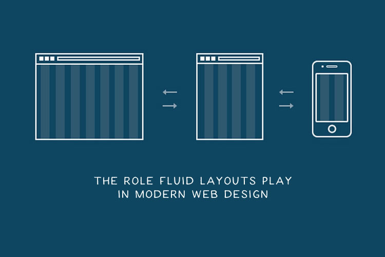
Modern web design often uses fluid layouts, which adapt to different screen sizes by using percentages instead of fixed pixel widths.
Instead of specifying a fixed 960-pixel content area, designers now create layouts that take up a percentage of the screen, like 80%. Columns can also be sized in percentages, making elements flexible and responsive.
Here’s a comparison of CSS for fixed and static layouts and fluid layouts:
Fixed:
.content { width: 960px; }
.left, .right { width: 180px; }
.middle { width: 600px; }
Fluid:
.content { width: 80%; }
.left, .right { width: 18%; }
.middle { width: 64%; }
Now, let’s dive into another vital aspect of responsive web design.
Bootstrap

Bootstrap is a fantastic tool for creating responsive websites effortlessly.
It’s an immensely popular open-source toolkit that streamlines the process of designing responsive sites.
Bootstrap offers various features like Sass variables, prebuilt components, responsive images, grid systems, and more.
The best part? You don’t need to be a web design expert to use Bootstrap.
It’s accessible to beginners and pros alike, offering great flexibility to tailor websites to your needs.
Getting started with Bootstrap is a breeze.
Here’s how to set it up:
Add this code to your webpage:
To start using Bootstrap, simply insert the below code into your webpage:
<meta name=”viewport” content=”width=device-width, initial-scale=1.0″>
This simple meta tag tells the browser you’re creating a responsive website. How? It instructs the browser to adjust the website’s width based on the device width and maintain a default scaling of 1.
Bootstrap makes responsive web design easy for everyone!
Attaching Bootstrap
<link rel=”stylesheet” href=”css/bootstrap.css”>
<link rel=”stylesheet” href=”css/bootstrap-responsive.css”>
Now, let’s break down the website building grid layout process into five main components: navigation, information area, content section, right sidebar, and footer.
Navigation Bar:
Create a responsive navigation bar with this code:
<nav class=”navbar fixed-top navbar-expand-md navbar-light bg-light”>
<div class=”container”>
<a class=”navbar-brand” href=”#”>Responsive Bootstrap Website</a>
<button class=”navbar-toggler” type=”button” data-toggle=”collapse” data-target=”#navbarCollapse” aria-controls=”navbarCollapse” aria-expanded=”false” aria-label=”Toggle navigation”>
<span class=”navbar-toggler-icon”></span>
</button>
<div class=”collapse navbar-collapse” id=”navbarCollapse”>
<ul class= “navbar-nav mr-auto”>
<li class= “nav-item active”>
<a class=”nav-link” href=”#”>Home<span class=”sr-only”>(current)</span></a>
</li>
<li class=”nav-item”>
<a class=”nav-link” href=”#”>About</a>
</li>
<li class=”nav-item”>
<a class=”nav-link” href=”#”>Blog</a>
</li>
</ul>
<ul class=” nav navbar-nav ml-auto”>
<li class=”nav-item”>
<a class=”nav-link” href=”#”>Login</a>
</li>
<li class=”nav-item”>
<a class=”nav-link” href=”#”>Register</a>
</li>
</ul>
</div>
</div>
</nav>
Information Area:
Use the “jumbotron” class to create an attractive information section. Don’t forget to use the div tag for organization.
Content Section:
For your content section, structure it using “col-md-*” classes to ensure responsiveness.
Right Sidebar:
Prepare the right sidebar to complement your content.
Footer:
Create a footer to display business information and copyright details. That’s it! By following these steps and using Bootstrap, you’ll have a basic responsive website up and running.
Adaptive Web Design
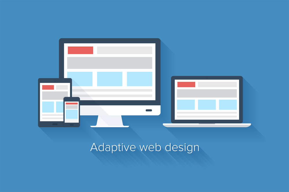
Adaptive web design, also called dynamic serving, is another approach to creating websites that can adapt to different devices.
Unlike responsive design, which uses a a single page layout that adjusts to different screen sizes, adaptive design uses multiple pre-defined layouts that are specifically designed for different device categories, such as mobile, tablet, and desktop.
The server detects the user’s device with an adaptive design and serves the browser width with the appropriate layout and content.
This means that the website can provide a tailored user experience based on the capabilities and constraints of the device. For example, an adaptive website might display larger buttons and fonts for touchscreens on mobile devices while providing a more detailed navigation menu for desktop users.
Adaptive design requires more upfront planning and development than responsive design, as multiple layouts must be created and maintained.
However, it can provide a more optimized experience for users on specific devices, as each layout is tailored to their needs. Adaptive design is often used for complex websites or applications where customizing the user experience for different devices is essential.
Advantages of Adaptive Web Design:

Adaptive web design (AWD) is another approach to creating websites that cater to various device types and screen sizes.
While it shares some similarities with responsive web design (RWD), it has its own unique advantages.
The advantages of adaptive web design:

- Precise Optimization: Adaptive design offers precise control over the user experience on each device, ensuring optimal performance and functionality.
- Enhanced Performance: By delivering only the necessary assets and content for a specific device, adaptive design can improve loading times and overall performance.
- Fine-Tuned User Experience: Designers can create highly customized experiences, taking advantage of each device’s unique features.
How to Create Adaptive Web Designs
Creating a website involves key steps:
- Planning the design using tools like Axure or Mockplus for prototypes.
- Crafting the user interface (UI) and user experience (UX).
- Building the front end using HTML, CSS, and JavaScript.
- Developing the back-end with languages like Java, PHP, or Ruby.
For exceptional adaptive web design, follow these steps:
Step 1: Meta Tags
To make sure your website looks good on all types of screens, use meta tags.
These tags inform the browser about the viewport width and prevent it from initializing the single-page layout.
For example, you can use the following viewport meta tag to set the viewport width equal to the device screen width:
<meta name=”viewport” content=”width=device-width, initial-scale=1.0″>
Step 2: HTML Structure
The HTML structure of your web page plays a crucial role in adaptive web design.
It’s important to create a well-organized layout that can easily adapt to different screen sizes.
For example, you can divide your page into sections such as Header, Content, Sidebar, and Footer.
Specify fixed heights and widths for these sections to maintain consistency across all browser sizes and devices.
Step 3: Media Queries
CSS3 media queries are like magic for making websites fit different screens.
With these, you can tell the website to look one way on big screens and another way on small screens.
It’s like a special instruction for the browser to show the page just right on any device.
For example, you can use the following CSS code to target screens with a maximum width of 480 pixels:
@media screen and (max-width: 480px) {
/* CSS styles for screens with a maximum width of 480px */
When to Use Adaptive Web Design:
Adaptive web design is a smart choice in these situations:
If you have a complex website that’s hard to maintain, adaptive design is the answer.
It streamlines your site, making it user-friendly and effective on mobile devices.
For sites where speed is crucial, adaptive design shines.Users love fast-loading web pages, and with adaptive design, you get optimized versions for different devices, ensuring quick loading and a smooth experience.
If you run a smaller website and want to conserve resources, adaptive design is your friend.
It’s straightforward to create and won’t strain your resources.
Adaptive Web Design Examples
Now that we have a good understanding of the principles and process behind adaptive web design let’s explore some inspiring examples of AWD in action:
Example 1: Amazon
Amazon is one of the pioneers of adaptive web design.
The company encourages users to download their branded applications, which offer a faster and more tailored shopping experience.
By adopting AWD, Amazon has improved its mobile access speed and provides users with the option to use the “Amazon.com full site” on mobile devices.
Example 2: Apple
Apple’s website is known for its clean and minimalist design.
By utilizing adaptive web design, Apple ensures that its website adapts to different devices and functions accordingly.
This approach allows Apple to provide a consistent and seamless experience across various platforms.
Example 3: Avenue 32
Avenue 32, an online luxury shopping site, is another excellent example of adaptive web design.
The brand collaborated with Usablenet to create a visually appealing and intuitive mobile and tablet experience.
By using AWD, Avenue 32 was able to enhance the discovery and shopping functions, resulting in increased mobile transactions and traffic.
Example 4: USA Today
USA Today leverages adaptive web design to provide a tailored experience to its users.
By detecting specific devices and considering factors such as operating system and screen and font size used, USA Today ensures that its website delivers a rich and optimized experience.
This approach has proven to be more effective for delivering news content compared to responsive design.
Example 5: About.com
About.com, a popular information website, has adopted adaptive web design to cater to different devices and screen sizes.
This makes it easy for users to access the site quickly, no matter their device.
By embracing AWD, About.com ensures a seamless user experience and improved accessibility.
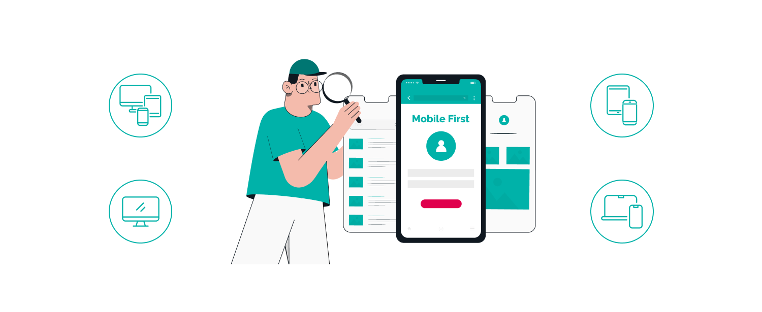
Mobile-First Design
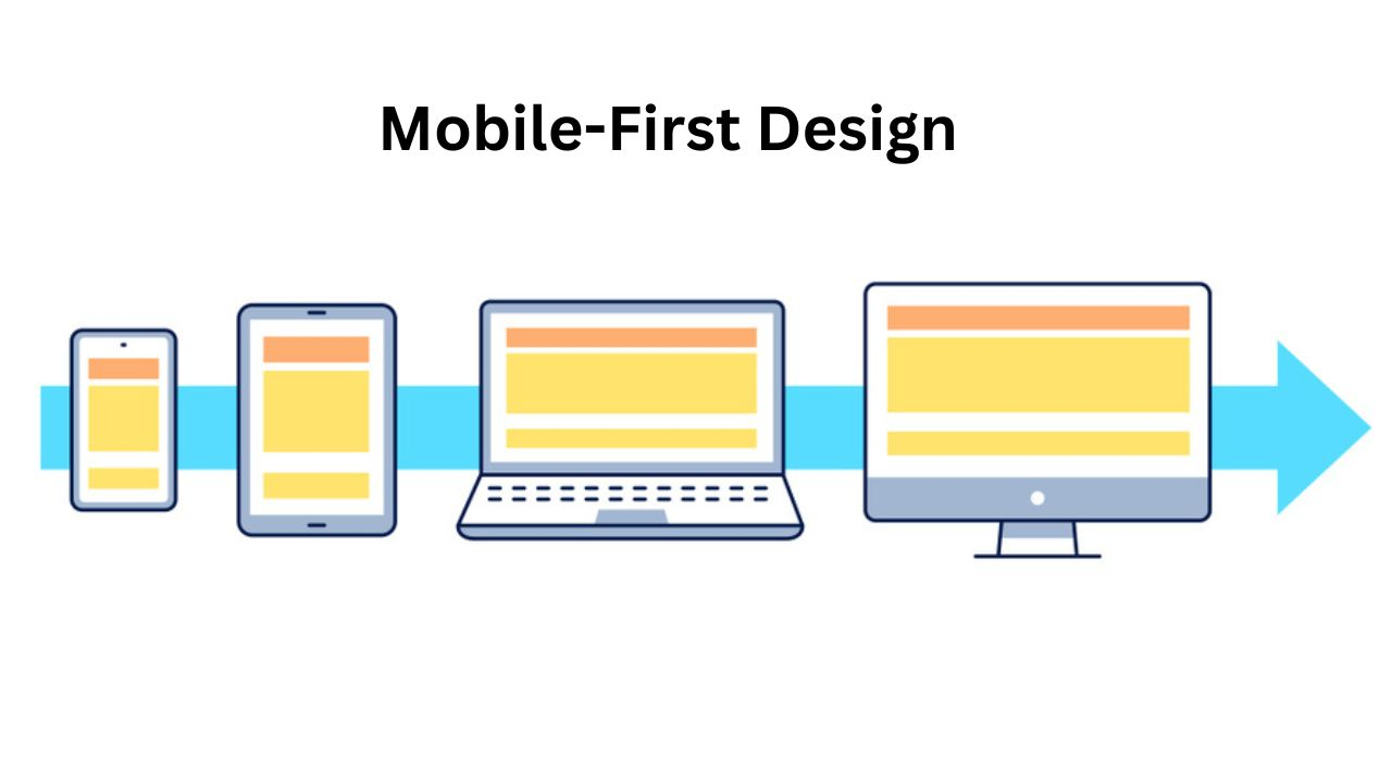
With more people using mobile devices for the internet, a design approach called ‘mobile-first’ has become popular.
Mobile-first means making the mobile version of a website first and then the desktop version.
It’s all about giving the best experience to people on their phones and tablets since those are the main devices they use to go online.
In mobile-first design, the focus is on creating a streamlined and efficient user interface that is optimized for small screens and touch interactions.
This often involves simplifying the website layout, reducing the amount of content, and prioritizing key actions and information.
By starting with the mobile version, designers can ensure that the most critical elements are prioritized and that the website loads fast on mobile devices.
Once the mobile version is designed and developed, the desktop version can be created by adding additional features and optimizing the layout for larger screens.
This approach allows businesses to deliver a mobile-friendly experience without compromising the functionality of the desktop version.
Advantages of Mobile-First Web Design:
Mobile-first web design is a method of web development where the primary focus is on designing and optimizing a website for mobile devices before scaling up to larger screens.
The Advantages:
- Improved Mobile Experience: Websites built with a mobile-first approach provide a superior experience for mobile users, which is essential given the growing use of smartphones for web browsing.
- Future-Proofing: Starting with mobile ensures that the website is ready for the future as mobile device usage continues to rise.
- Simplified Content Strategy: Mobile-first design forces a clear focus on essential content and features, streamlining the user experience.
When to Use Mobile-First Web Design:
Mobile-first design is ideal for websites targeting a broad audience, especially if mobile traffic is significant.
It’s especially relevant for businesses that want to ensure a great mobile user experience, as well as those who want to be prepared for future shifts in user behavior.