Now, let’s delve into another critical aspect of effective website construction: the layout of an e-commerce site.
Did you know that an unattractive layout can deter 38% of visitors from engaging with your website?
Small issues like poor user experience, a confusing menu or clunky navigation can quickly drive away potential visitors.
A well-designed layout can be your savior, making your content accessible, easy to digest, and intuitive.
Let’s explore some examples that will surely please your site visitors:
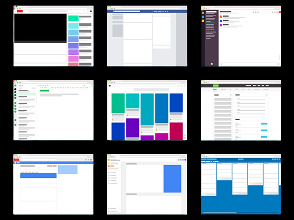
Single Column Layout

The single-column layout is a straightforward and versatile format that can be applied to various website designs.
This layout presents site information in a single vertical column, allowing users to scroll through the content. This simplicity makes it particularly mobile users well-suited for mobile screens.
Split Screen Layout
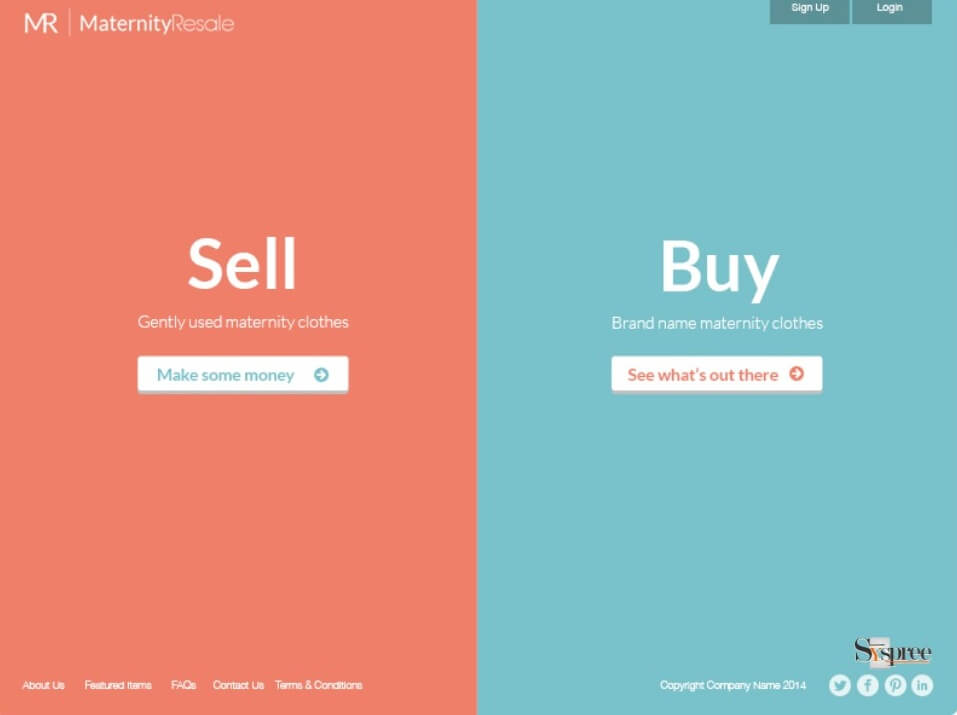
The split screen layout is an excellent choice when you need to showcase two distinct pieces of content that are equally important but different from each other.
By dividing your website into two sections, you can streamline the user experience without confusing visitors with contrasting navigation.
It’s ideal for sites offering two key features or categories, such as membership websites, such as a men’s and women’s shopping section.
F-Shape Layout

Another versatile option that complements most web design styles is the F-shape layout.
Research has demonstrated that users tend to scan web pages in an F pattern. Consequently, web designers structure their site elements to align with this natural behavior.
This template shines when your website contains a fluid design, a wealth of information, and numerous elements.
Grid of Cards Layout
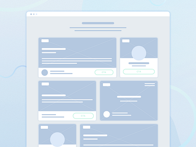
The Grid of Cards layout works wonders for content-heavy websites or those offering various media options.
Think of video streaming sites like YouTube and Netflix, which present content in bite-sized previews or cards.
These cards serve as containers for clickable information, organized in a grid system for a neat and user-friendly display.
Each card typically includes a preview image, making it easy for users to find what they’re looking for.
Boxes Layout
The Boxes layout is your go-to option if you prefer an organized approach.
This layout consists of a large box as the primary container, housing two to five smaller boxes containing additional content.
Each smaller box can lead users to another page with more information and options, whether they are images, descriptions, or call-to-action buttons.
eCommerce websites, portals, and personal websites frequently employ this layout to systematically showcase their content or products.
These well-structured layouts can significantly enhance the user experience on your website and keep your visitors engaged.